What Makes a Good User Interface? Steal These 7 Tactics
Ever stared at a website and thought, “What on earth am I looking at?” We've all been there. A good user interface shouldn't make you think – it should just work.
But what exactly makes a good user interface? After testing hundreds of websites and apps, I've distilled it down to 7 core tactics that separate the brilliant from the bewildering.
- Simplicity is key; reduce clutter to enhance user decision-making and reduce frustration.
- Visual hierarchy guides users effectively, ensuring they notice crucial elements first.
- Consistency in design reduces cognitive load, making interfaces more comfortable for users.
- Responsive design must optimise user experience across devices, not just resize elements.
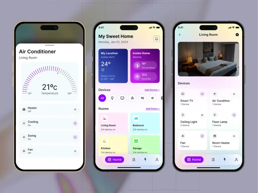
- Tactic 1: Simplicity Trumps Everything
- Tactic 2: Visual Hierarchy That Guides the Eye
- Tactic 3: Consistency Creates Comfort
- Tactic 4: Responsive Design That Actually Works
- Tactic 5: Feedback That Acknowledges Users
- Tactic 6: Intuitive Navigation Systems
- Tactic 7: Accessibility as a Foundation, Not an Afterthought
- Common UI Design Pitfalls to Avoid
- How to Test Your UI Design
- Practical Examples of Outstanding User Interfaces
- Implementing These Tactics in Your Design Process
- FAQS About Good User Interface Design
Tactic 1: Simplicity Trumps Everything
Right, let's get straight to it. The best interfaces don't try to dazzle you with bells and whistles. They get out of your way.
Think about Google's homepage. It's literally a search bar and a logo. That's it. And yet, it handles billions of searches daily without breaking a sweat.
When designing your interface, ask, “Can I remove this element without affecting functionality?” If the answer is yes, bin it. Your users will thank you.
A cluttered interface forces users to make unnecessary decisions. Each decision creates mental friction, and friction leads to frustration. Studies show that users make decisions within milliseconds of landing on your page – make those milliseconds count.
“Simplicity is about subtracting the obvious and adding the meaningful.” – John Maeda.
The magic happens when you strip away everything that doesn't serve a purpose. I recently worked with an e-commerce client who removed 40% of their homepage elements. The result? Conversion rates jumped by 25%.
How to implement simplicity:
- Identify the primary action you want users to take
- Remove all elements that don't support that action
- Use whitespace strategically to create breathing room
- Limit options to prevent decision paralysis
Tactic 2: Visual Hierarchy That Guides the Eye
Your interface should work like a tour guide, leading users exactly where they need to go. This is visual hierarchy in action.
Visual hierarchy determines what users see on your page first, second, and third. Get it right, and users intuitively flow through your content. Get it wrong, and they're clicking the back button faster than you can say “bounce rate.”
Size, colour, contrast, and spacing contribute to effective visual hierarchy. The most significant elements naturally draw attention first, while contrasting colours signal importance.
Last year, I worked with a SaaS company whose call-to-action button was the same colour as their background elements. We changed it to a contrasting colour and saw click-through rates improve by 32%. Sometimes the most minor changes yield the most significant results.
Elements of strong visual hierarchy:
- Size: Larger elements get noticed first
- Colour: Use contrast to highlight necessary actions
- Spacing: Group related items together
- Positioning: Place critical elements in hot spots (top-left for Western readers)
- Typography: Vary font weights to indicate importance
Check out Inkbot Design's guide on visual hierarchy for more detailed insights on creating effective layouts.
Tactic 3: Consistency Creates Comfort
Ever used an app where the back button sometimes appears in the top-left and sometimes in the bottom-right? Maddening, isn't it?
Consistency in user interface design isn't just about aesthetics – it's about reducing cognitive load. When elements behave predictably, users can focus on their tasks rather than figuring out your interface.
This applies to everything from button styles to terminology. If you call it a “dashboard” on one page, don't call it a “control panel” on another.
A client of mine recently consolidated their icon library from 200+ unique icons to just 40 standardised ones. User task completion improved by 18% because users didn't need to learn new visual languages as they moved through the site.
Ways to maintain consistency:
- Create a UI component library for reusable elements
- Standardise spacing between elements
- Use consistent terminology throughout
- Maintain button styles across all screens
- Follow platform conventions when appropriate
Tactic 4: Responsive Design That Actually Works

In 2025, this shouldn't need saying, but I still encounter websites that look brilliant on desktop and fall apart on mobile. Or worse, sites that are technically “responsive” but practically unusable.
Good responsive design isn't just about making things fit on different screens. It's about optimising the experience for each device.
This means thinking about touch targets (fingers are less precise than mouse pointers), considering thumb zones on mobile devices, and sometimes completely rethinking navigation for smaller screens.
I recently audited a website that had a complex mega-menu on desktop. Rather than just cramming that same structure into a hamburger menu on mobile, we reimagined the journey completely, focusing on the top 5 user paths. Mobile conversions increased by 40%.
Responsive design best practices:
- Design for mobile first, then scale up
- Ensure touch targets are at least 44×44 pixels
- Consider thumb zones when performing necessary actions
- Test on actual devices, not just simulators
- Optimise images and media for different screen sizes
For more on creating truly adaptive interfaces, check out Inkbot Design's comprehensive approach to responsive design.
Tactic 5: Feedback That Acknowledges Users

Imagine pressing a lift button that doesn't light up. You'd probably press it again, wouldn't you? And again? And maybe once more for good measure?
This is why feedback is crucial in user interfaces. Every user action deserves a reaction, even if it's subtle.
Good feedback comes in many forms:
- Visual: Button changes colour when pressed
- Auditory: A subtle sound confirms an action
- Tactile: Vibration on mobile devices
- System status: Progress bars, loading indicators
- Confirmation messages: “Your form has been submitted”
I worked with a client whose checkout process suffered from high abandonment rates. An investigation revealed that after clicking “place order,” users saw no immediate feedback – the system was processing their payment without indicating it. We added a simple animated progress indicator, and abandonment dropped by 23%.
Implementing effective feedback:
- Make feedback immediate and clear
- Ensure it's appropriate to the action (subtle for minor actions, more obvious for major ones)
- Use multiple feedback types for critical actions
- Consider accessibility (don't rely solely on colour changes)
- Provide clear error messages that explain how to fix problems
Tactic 6: Intuitive Navigation Systems
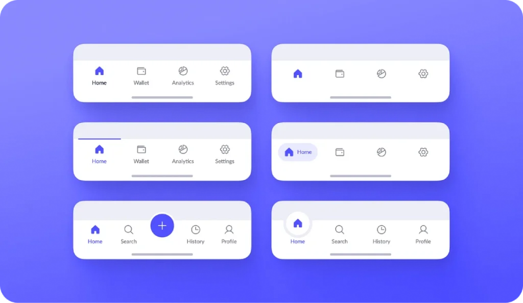
Navigation is the roadmap to your content. If users get lost, they leave.
The best navigation systems feel invisible because they align with users' mental models – their expectations of how things should work.
This doesn't mean you need to be boring. It means understanding your users' goals and creating clear paths.
A client of mine recently abandoned their “creative” navigation system (which used unique icons without labels) in favour of a standard approach with clear text labels. Their usability test scores improved by 60%, and time-on-site increased by 3 minutes on average.
Navigation best practices:
- Use clear, descriptive labels
- Limit top-level categories to 7 or fewer
- Ensure users always know where they are in the site structure
- Provide multiple ways to access important content
- Test navigation with real users before implementing
Tactic 7: Accessibility as a Foundation, Not an Afterthought

Here's a sobering statistic: approximately 15% of the world's population lives with some form of disability. That's over a billion potential users who might struggle with your interface.
But here's the thing – designing for accessibility improves the experience for everyone. Consider:
- Clear colour contrast helps users in bright sunlight
- Keyboard navigation helps power users move quickly
- Simple language benefits non-native speakers
- Descriptive button labels help distracted users
Last month, I audited a website with beautiful grey text on a light grey background. It looked sleek but had failed accessibility standards. After increasing the contrast, more people could use the site, and comprehension improved for all users.
Accessibility fundamentals:
- Maintain sufficient colour contrast (4.5:1 minimum for standard text)
- Support keyboard navigation for all interactive elements
- Add alt text to images
- Structure content with proper heading hierarchy
- Test with screen readers
When accessibility becomes a fundamental design principle rather than a checkbox exercise, everyone benefits. For a deeper dive into creating inclusive designs, explore Inkbot Design's accessibility guidelines.
Common UI Design Pitfalls to Avoid
Now that we've covered what to do, let's talk about what not to do:
- Prioritising aesthetics over usability: Pretty doesn't equal functional. Always test with real users.
- Ignoring platform conventions: Users have established expectations for how things work on different platforms. Defy these at your peril.
- Feature creep: Adding features without considering their impact on the overall experience leads to bloated, confusing interfaces.
- Neglecting error states: Users will make mistakes—design for these scenarios with helpful error messages and recovery paths.
- Assuming users think like designers: They don't. What seems evident to you might be completely baffling to your users.
How to Test Your UI Design
Creating a good user interface isn't a one-and-done process. It requires continuous testing and refinement.
Here are some effective testing methods:
- Usability testing: Watch real users interact with your interface and identify pain points.
- A/B testing: Compare different versions to see which performs better.
- Heatmaps: See where users are clicking and scrolling.
- Session recordings: Watch how users navigate through your site.
- Analytics: Use data to identify drop-off points and conversion obstacles.
A word of caution: don't rely solely on user feedback. What users say they want and how they behave can be wildly different. Always observe actual behaviour.
Practical Examples of Outstanding User Interfaces
Let's look at some real-world examples that exemplify the tactics we've discussed:
Airbnb

Airbnb simplifies a complex process (finding accommodation) with a clean, intuitive interface. Their search function anticipates user needs with smart filters and visual results highlighting critical information.
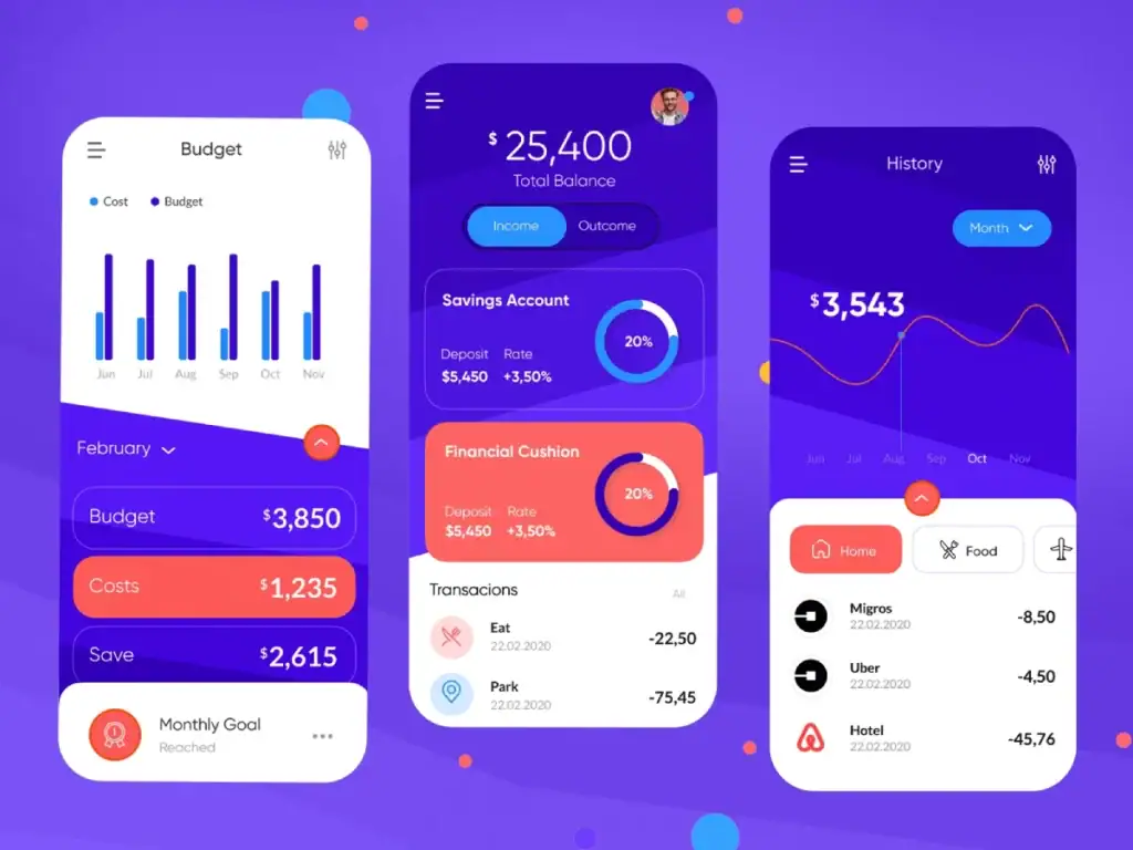
Monzo Banking App

Monzo uses colour and visual hierarchy brilliantly. The app makes banking, traditionally a dry, complex subject, feel approachable and straightforward. Their transaction feed uses simple icons and clear categorisation to help users understand their spending habits at a glance.
Headspace
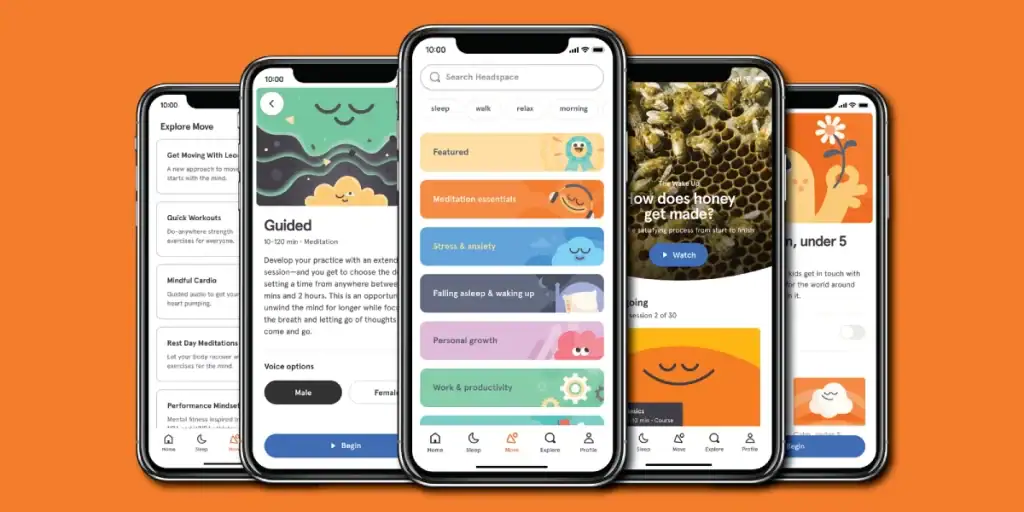
The meditation app Headspace uses consistent, friendly illustrations and a progressive disclosure approach, revealing features gradually as users become more familiar with the app. This prevents overwhelming new users while still offering depth for experienced ones.
Implementing These Tactics in Your Design Process
Ready to improve your user interfaces? Here's a practical approach:
- Start with user research: Understand who your users are and what they need.
- Create user flows: Map out users' journeys through your interface.
- Wireframe before designing: Focus on structure before aesthetics.
- Apply the 7 tactics: Use them as a checklist for your designs.
- Test with real users: Gather feedback and iterate.
- Launch and monitor: Use analytics to identify opportunities for improvement.
- Refine continuously: Good interfaces evolve based on user behaviour and needs.
FAQS About Good User Interface Design
What's the difference between UI and UX?
User Interface (UI) refers to the visual elements users interact with – buttons, text fields, and navigation components. User Experience (UX) encompasses the entire experience, including UI, but also extends to information architecture, user research, and content strategy. A good UI contributes to a good UX, but UX is the broader concept.
How do I know if my interface is intuitive?
Your interface is intuitive if first-time users can accomplish basic tasks without instructions. The best way to test this is through usability testing with people who match your target audience. Watch them use your interface without guidance and note where they get stuck.
Should I follow design trends?
It depends. Trends can keep your interface current, but they should never compromise usability. Ask yourself: “Does this trend help users accomplish their goals more effectively?” If not, it's probably not worth implementing.
How many clicks is too many?
There's no magic number. What matters is whether each click feels logical and necessary to users. Three meaningful, confident clicks are better than one confusing click. Focus on making each step clear rather than minimising the number of steps.
How do I balance aesthetics and functionality?
Start with functionality, then apply aesthetics in a way that enhances rather than hinders that functionality. Good design isn't just about looking good – it's about working well. The best interfaces achieve both.
What role does typography play in UI design?
Typography is crucial for readability, hierarchy, and brand personality. Choose legible fonts at various sizes, use clear hierarchy to guide users through content, and ensure sufficient contrast. Limit the number of font families to maintain consistency.
How can I make my interface more accessible?
Start with the basics: sufficient colour contrast, keyboard navigation, alt text for images, and clear heading structure. Test with accessibility tools like screen readers. Remember that accessibility benefits all users, not just those with disabilities.
What's the most essential element of a good user interface?
Clarity. Nothing else matters if users don't understand what they're looking at or how to use it. Every design decision should serve the goal of making the interface clearer and easier to use.
How do I design for different user skill levels?
Progressive disclosure is key – reveal advanced features gradually as users become more comfortable with your interface. Provide clear defaults for beginners and customisation options for advanced users. Consider creating different user paths based on expertise level.
Can a good UI compensate for poor functionality?
No amount of interface polish can fix broken functionality. If the underlying system fails, users will still have a poor experience. Fix the functionality first, then create an excellent interface around it.
How do I convince stakeholders to invest in UI improvements?
Frame UI improvements in terms of business outcomes. Show how better interfaces can increase conversion rates, reduce support costs, improve user retention, and enhance brand perception. Use case studies and A/B test results to demonstrate the ROI of good UI design.
What tools should I use for UI design?
Popular tools include Figma, Adobe XD, and Sketch for design; InVision and Protopie for prototyping; and UsabilityHub and Hotjar for testing. However, the best tool is the one that fits your workflow. Focus on principles first, tools second.
Good user interface design isn't rocket science but requires intention, empathy, and attention to detail. By applying these seven tactics consistently, you'll create interfaces that users enjoy using, often without even noticing the interface at all. And that's the highest compliment a UI designer can receive.
Looking to improve your brand's user interfaces? Request a quote from Inkbot Design to discover how professional design can transform your digital presence.

 Pinterest
 Facebook
 LinkedIn
 WhatsApp
